Sensor calibration goes from a choke-point to a buttery smooth pipeline
COMPANY
Density.io
DURATION
3 Weekly Sprints
ROLE
Product Design Lead

OVERVIEW
From bottleneck to pipeline. Three sprints. Two products. One redesign
Every Density sensor had to clear one internal gate before it ever reported data
That gate was Sensei, Density's internal deployment platform. Density's IoT sensors needed calibration after physical installation before they could deliver accurate occupancy data to customers. Calibration itself was outsourced to a third-party partner and ran on a velocity Density didn't fully control. Everything around that step, the triage, the signal parsing, the escalation routing, and the tagging of miscalibrations, belonged to Density. Sensei was where all of that happened. It had grown out of necessity over the years, and by early 2020 it needed to evolve to meet the demand of a scaling enterprise pipeline.
When Sensei worked, customers saw their data fast. When it didn't, they waited, and customer success absorbed the load. The three-sprint redesign rebuilt the tool around the teams living inside it, closed a long-standing calibration bottleneck, and made multi-sensor install shippable as a byproduct.

Sales was closing faster than sensors could calibrate. And the calibration step itself wasn't ours to move
The Challenge
Enterprise deployments were signing at a pace the existing Sensei workflow couldn't match. Physical install was one part of the deployment pipeline. Calibration was another, handled by a third-party partner running at a velocity Density couldn't directly accelerate. Everything on Density's side of the platform had to move faster to compensate. Faster identification of stuck sensors. Faster triage of root causes. Faster routing to the right resolver. The existing Sensei tool couldn't do any of that well.
Every stuck sensor looked identical in the queue regardless of root cause. Install failures, calibration failures, network failures, and configuration errors all surfaced the same way, forcing manual investigation on every ticket. Miscalibrations weren't attributed to their actual source, so the same problems kept recurring without systemic fixes. Customer success absorbed the triage load. Partners worked around the tool in their own spreadsheets. New customers absorbed the wait, during the exact window when first impressions were forming.
Four converging pressures
Calibration ran on a partner velocity: The actual calibration step sat with a third party, which set the effective ceiling on deployment speed. Everything else had to accelerate to compensate.
One queue, many root causes: Install failures, calibration failures, network failures, and config errors all surfaced identically, forcing manual investigation on every stuck sensor.
Miscalibrations went unattributed: The tool couldn't tag a failure with its actual source, so problems recurred without ever getting fixed at the root.
Signals were buried, not surfaced: Sensei exposed raw telemetry without triage logic or prioritization. Critical information was available but not visible when it mattered.

SOLUTION
Time-to-value was the North Star. Everything else became configuration
What the shipped tool did differently
The shipped tool organized every sensor in the system into a queue sorted by proximity to calibration completion and customer impact. Stage-specific surfaces replaced the general dashboard. Health signals rolled up into single triage flags. Operators and third-party partners worked in the same tool. The queue model also cleared the prerequisite for multi-sensor install, a backlog ticket that had been sitting in Density's roadmap since before this engagement started. The redesign didn't just fix the existing tool. It changed what was buildable on top of it.
Shipped capabilities
Queue-first interface: Every active sensor sorted by proximity to calibration completion and customer impact.
Stage-aware surfaces: Pre-Configured, In-Configuration, and Configured each get their own view tailored to that state.
Shared operator and partner access: Customer success and third-party partners work in one tool, not across spreadsheets.
Signal-to-action surfacing: Scattered telemetry rolled into single triage flags, with the recommended next action surfaced alongside.

RESEARCH
Three internal teams lived inside the tool. None of them were Density's customers
A platform designed for the people Density had never designed for
Density had spent its early product years designing for facilities managers and portfolio owners, the people who bought the platform. Sensei sat inside a different audience entirely. Customer success owned the calibration timeline. Product set workflow expectations and SLAs. Support fielded partner and customer escalations. Deployment engineers handled technical escalations for hardware, firmware, and network anomalies. None of them were paying customers, and most had never been designed for explicitly. Discovery mapped those archetypes and decided which ones the sprint had to serve first.
Primary user archetypes
Customer Success lead: Owns the calibration timeline end to end, accountable for time-to-value.
Product manager: Defines workflow expectations and SLAs for the calibration phase.
Support lead: First responder for partner and internal escalations during calibration.
Deployment engineer: Technical escalation path for hardware, firmware, and network anomalies.
Find the bottleneck. Fast. Before going deep on anything else
Rapid research, tuned to the sprint arc
The first research priority was locating where the calibration bottleneck was actually happening. Was it the partner's workflow? The handoff between install and calibration? Network conditions at the site? Triage ambiguity inside Sensei itself? Early interviews made clear it was rarely one thing and almost always several at once, compounded by Sensei's inability to distinguish between them.
Research had to move faster than the deployment pipeline. Every day spent in deeper research was another day of customer wait. The plan was scoped around targeted, lightweight methods that could validate direction quickly and feed back into design within the same sprint.
Rapid research tactics
Bottleneck mapping: Pinpointed where calibration was stalling: handoff gaps, stuck partner states, and triage ambiguity inside Sensei.
Shadowing over interviews: Sat with customer success during live triages to see the actual workflow, not the reported one.
Incremental platform audits: Evaluated modern improvements to the existing platform that could ship inside one sprint, not a rebuild.
Assumption validation sprints: Tested each design hypothesis against real deployment data before going deep on a direction.
ANALYSIS
A dashboard wasn't going to cut it. We needed a tool that thought in stages
The single analytical move that made the rest possible
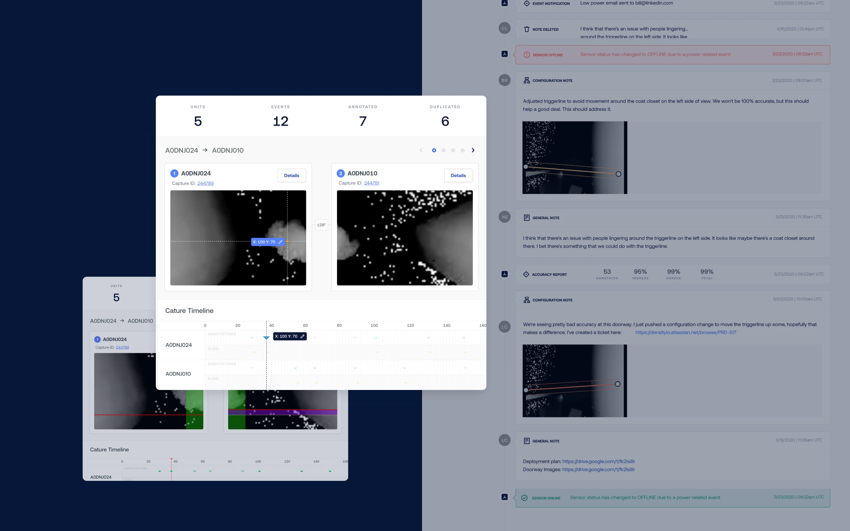
Before mapping screens, the configuration workflow was mapped stage by stage. Every sensor in the system passed through three distinct states, and each carried its own failure modes, user actions, and triage logic. Treating the workflow as one continuous flow was why the existing tool felt broken. Treating it as three stage-specific surfaces was why the new one could be designed at all.
The shift from state-agnostic to state-aware was the single analytical move that made the rest of the redesign possible. Each state surfaces its own data, its own actions, its own escalation paths. Miscalibrations became attributable. Signals became parseable. Bottlenecks became addressable before they blocked a deployment, not after.
Three states, three surfaces
Pre-Configured: Sensor is installed and on the network, awaiting calibration assignment and partner handoff.
In-Configuration: Sensor is actively calibrating, streaming early data for validation, partner-driven iteration.
Configured: Sensor is live, streaming reliable data to the customer's dashboard, handed off to ops.
How might we
How might we make the state of every calibration visible at a glance?
How might we surface the next action instead of the raw data?
How might we design the tool so partners and operators work inside it, not around it?


ITERATIONS
What operators needed. What executives would fund. We tested both, four rounds deep
Two research layers, two decisions
The four-round research program produced two distinct feedback channels. Operators pushed for speed, clarity, and triage logic matched to daily reality. Executives pushed for defensible metrics, partner relationship posture, and a queue model that could scale with the pipeline. Each sprint absorbed input from both and shipped a release that cleared a specific bottleneck. Nothing shipped that couldn't defend itself in both conversations.
Four rounds of post-iteration testing
Round 1, Operator baseline: Prototype sessions with CS, product, and support on triage workflow and state-specific surfaces.
Round 2, Operator refinement: Mid-fidelity validation of partner handoff logic, resulted in scoped partner workspaces instead of a shared queue.
Round 3, Executive review: VP-level sessions on queue logic scaling, partner posture, and business case alignment.
Round 4, Executive sign-off: C-suite sessions on strategic direction, investment scope, and time-to-value metric definition.


Sprint: 1
Implemented a triage queue to address calibration readiness and impact
Sprint: 2
Split the workflow into three unique views matched to each calibration state
Sprint: 3
Shipped multi-sensor install, unlocking enterprise-scale deployments
FINAL DESIGNS
Down to the last sensor. What blocked it, what would unstick it, what to do next
The shipped surfaces
The final designs closed the loop from queue to decision. Every active sensor was visible in the triage queue, sorted by customer impact and flagged where action was needed. Drilling into any sensor loaded the view matched to its current calibration state. Stuck sensors surfaced what had blocked them alongside the recommended next action. Raw telemetry stayed in the interface, available for investigation, but no longer blocked daily work.
Surface-level capabilities
Queue with triage flags: Every active sensor visible, sorted by customer impact, flagged where action is needed.
Stage-specific detail: Drilling into any sensor loads the view matched to its current calibration state.
Next-action guidance: Each stuck sensor surfaces what blocked it and the recommended action, not just raw telemetry.
One redesign. A third iteration shipped on top of it
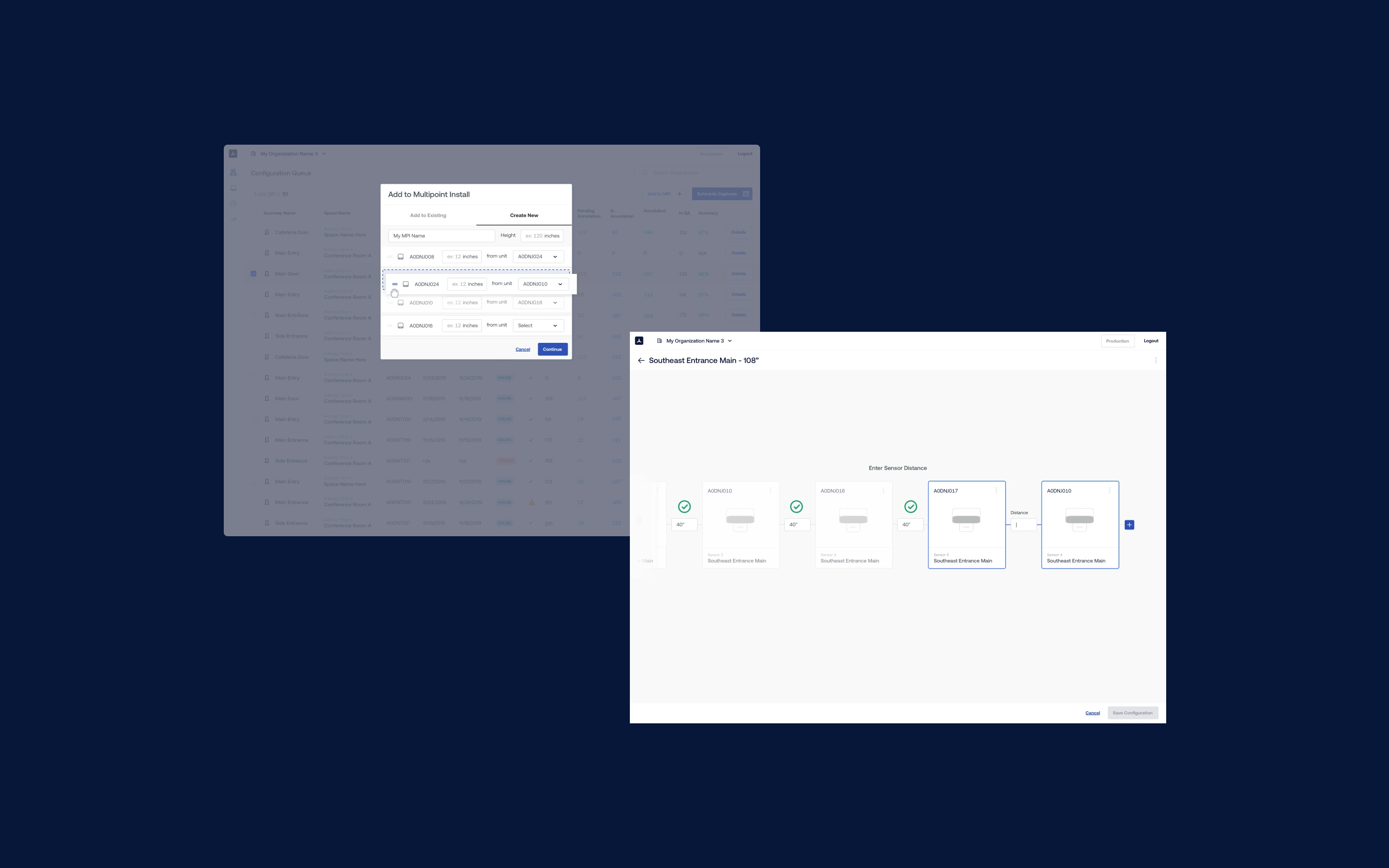
Multi-sensor install as a byproduct of the queue model
Multi-sensor install had been sitting in the backlog as a heavy lift for over a year. Once the Sensei queue model existed, the lift got smaller. Enterprise customers could now deploy at portfolio scale, not one sensor at a time, using the same stage-aware patterns already in the product. We put together quick designs using the existing design system and shipped the feature as a third, smaller iteration on top of the main redesign. It wasn't a co-equal product. It was evidence that the foundation had changed what was buildable on top.
What the third iteration delivered
Multi-sensor install unlocked: A backlog ticket that had been considered a heavy lift for over a year shipped as a byproduct of the redesign.
Portfolio-scale deployment: Enterprise customers could now deploy tens or hundreds of sensors at once, not one at a time.
One mental model: Single-sensor and multi-sensor install used the same stage-aware patterns, so no retraining was required.

IMPACT DELIVERED
Time-to-value became a product metric. Not a support cost
Three sprints closed with a calibration workflow Density's customer success team could run, measure, and defend
Calibrations moved through the queue faster. First impressions shifted from wait and see to see it work. Customer success stopped absorbing calibration friction as a support overhead and started reporting it as a product metric with a defensible trajectory. Partners worked inside the system, which collapsed the spreadsheet sprawl that had been obscuring ground truth. Multi-sensor install shipped as a byproduct. Density gained a time-to-value number it could quote during the sales cycle, which changed how the platform got sold.
What the shipped tool made possible
Calibrations moved from hours to minutes: Stuck sensors were flagged, triaged, and routed faster with triage-first workflow.
Customer success reclaimed bandwidth: Triage time dropped, proactive outreach became possible within the same headcount.
Partners worked inside the system: Third-party spreadsheet workarounds disappeared, data became single-source.
Engineering velocity compounded: Calibration friction stopped pulling engineers off product work, unlocking other bets.