From command line to AI-driven command center
COMPANY
Eino AI
DURATION
6 Bi-Weekly Sprints
ROLE
Lead Product Designer
OVERVIEW
Twelve weeks to design the interface layer for an AI product category that didn't have a name yet
Intuitive enough for daily planner workflows, transparent enough for engineers who don't trust black boxes, and polished enough to demo to a carrier where billions in infrastructure spending were at stake
Background
Eino had built an AI-powered network planning engine that could model telecom infrastructure decisions and forecast capital allocation years into the future. The engine worked. It ran in a command line, which suited the founding team and the engineers building the models. It didn't suit the audience that needed to sign off on billions in infrastructure spending. Carriers don't bet the capital plan on a tool their planners can't operate.
The engagement had a fixed window. Six bi-weekly sprints, twelve weeks total, to design and validate a full enterprise product before the Bell Mobility demo that would determine whether the platform had a future. There was no playbook to follow. In 2020, nobody was designing AI UX, because AI UX wasn't a category yet. No Claude. No GPT-4. No Figma AI. No established patterns for forecasting uncertainty, no conventions for how humans should verify model outputs, no pattern libraries for explaining why an AI recommended one decision over another. We were inventing the interaction vocabulary from first principles, for users who by definition couldn't trust AI, on a clock.
Billions in infrastructure decisions, running on tribal knowledge and four disconnected spreadsheets
The carrier's planners weren't the problem. The interface layer was
Capacity planners at one of Canada's densest urban networks were managing billions in infrastructure decisions through tools that never talked to each other. Planners juggled four data scenarios across separate spreadsheets with no integration. Trigger configuration, threshold setting, and demand forecasting were done by intuition, because no forecasting tools existed that the team could actually operate. Ring diagrams lived on one screen, raw data terminals on another, spreadsheets on a third. No single source of truth. 132 sites, zero visibility. Only the most experienced planners could operate effectively, and the entire workflow ran on institutional knowledge that lived in three people's heads.
An AI forecasting engine was the obvious answer. The harder question was what the interface looked like. Carrier engineers are paid to distrust systems they can't verify. Any AI product that hid its reasoning was dead on arrival. Any AI product that dumped raw model outputs on planners was dead on arrival for a different reason. The design problem wasn't the AI. It was the interface category that didn't exist yet.
The Workflow Gap
Manual Data Wrangling: Capacity planners juggled four data scenarios across separate spreadsheets with no integration. Each scenario required manually pulling from different data sources.
No Forecasting Tools: Trigger configuration, threshold setting, and demand forecasting were done by intuition. No models, no automation, no scenario comparison.
Disconnected Tool Chain: Planners spent more time context-switching between tools than actually analyzing data, and every transition was an opportunity to lose critical context.
132 Sites, Zero Visibility: The mental load of holding the entire network in working memory meant only the most experienced planners could operate effectively.

SOLUTION
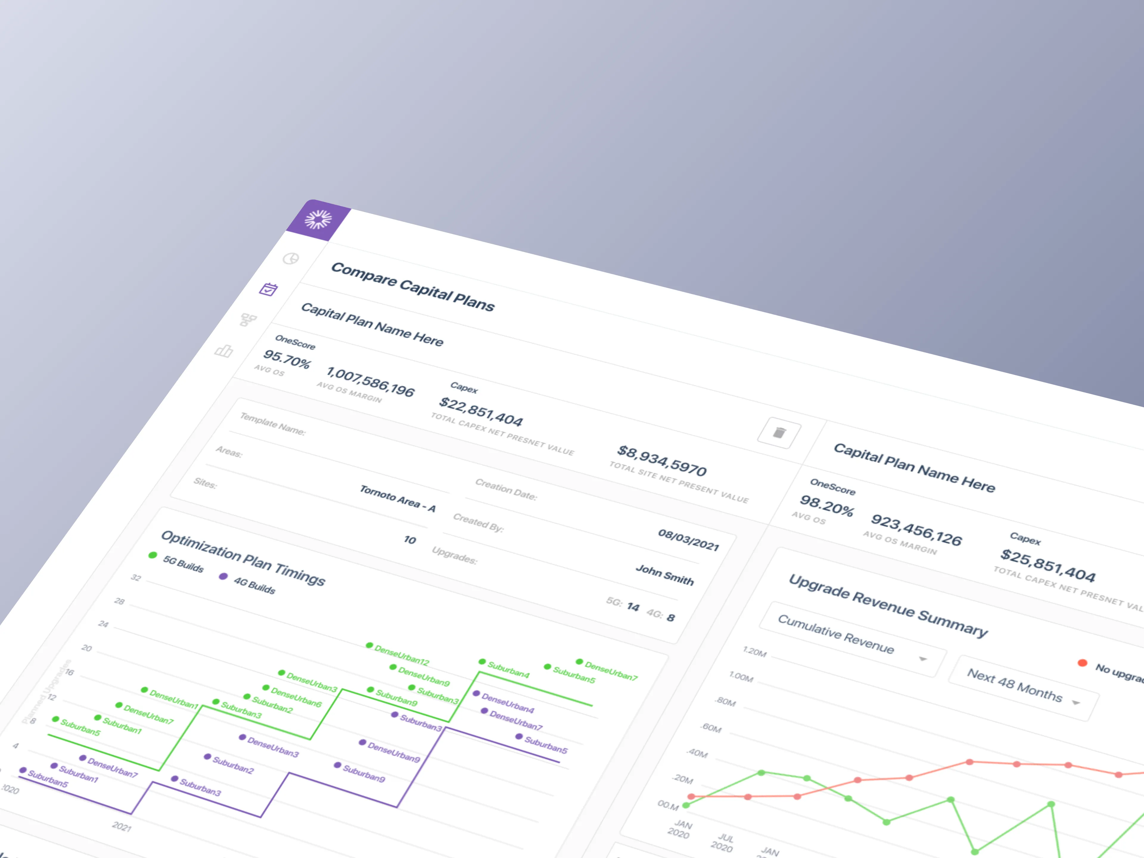
One tool. Four scenarios. Every site
Capacity planners could model four data scenarios, compare sites side-by-side, configure triggers and thresholds, and generate forecasts without context-switching between tools
How We Solved It
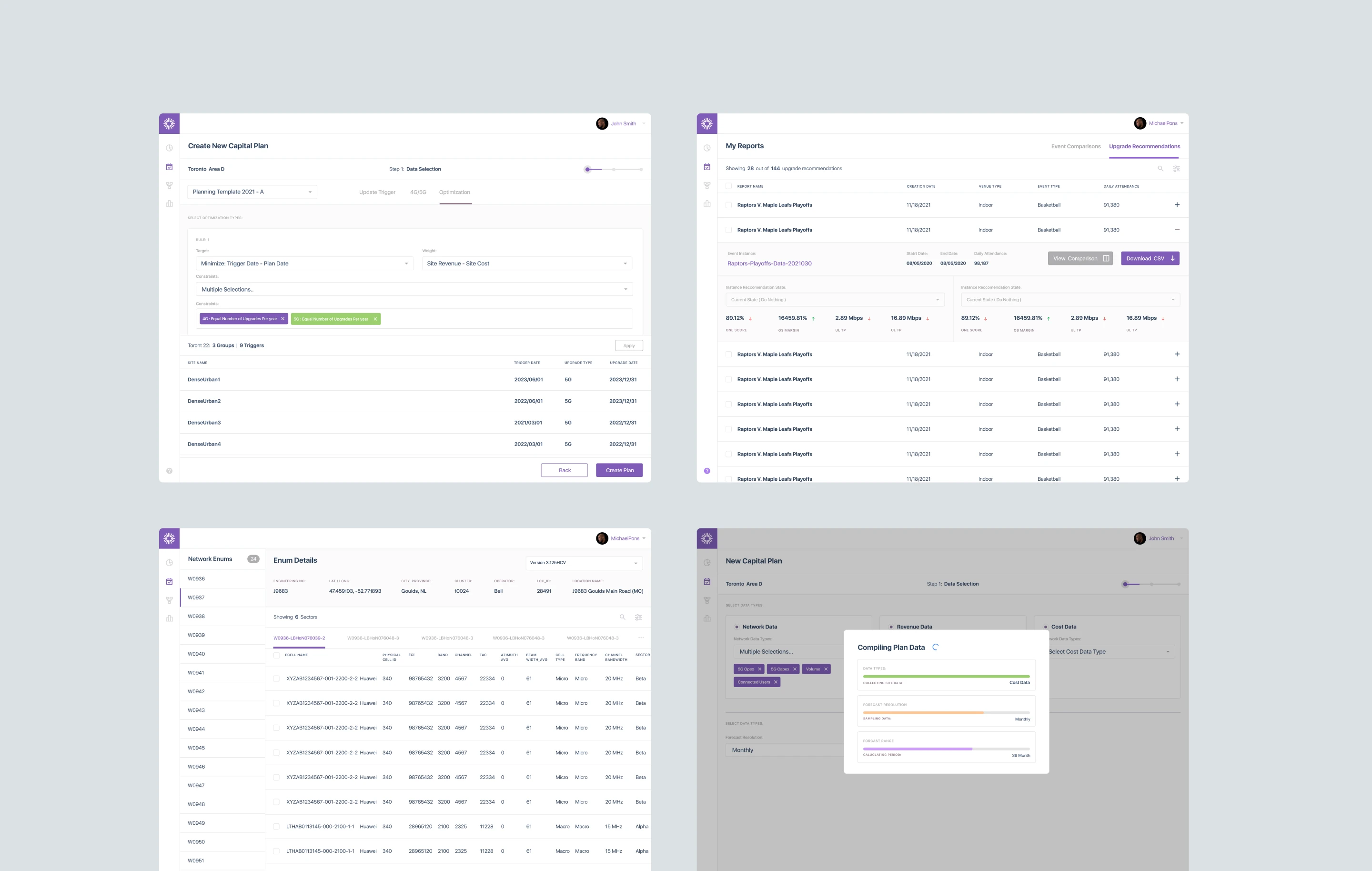
We designed a unified capital planning tool that replaced Bell Mobility's disconnected toolchain (spreadsheets, ring diagrams, and siloed data terminals) with a single application. The MVP shipped 50+ screens across 6 user journeys, covering the full workflow from template setup through report generation. Every interaction was designed around how planners actually think: site-first, not data-table-first.
The real design work wasn't the consolidation. It was the interface patterns for AI trust. Transparency into model reasoning wasn't a polish layer. It was the load-bearing wall. Every forecast had to show its work. Every recommendation had to be verifiable against the underlying data. Every scenario had to be comparable without requiring the planner to rebuild the comparison in their head. Six years later, these patterns would be standard in enterprise AI products. In 2020, we were writing them in real time.
Opportunity Areas
Unified Data Layer: Four data scenarios (Network, Revenue, Cost, Combined) accessible from a single interface instead of separate spreadsheets.
AI-Enabled Forecasting: LLM-driven capacity projections replacing tribal knowledge and gut-feel predictions, with full transparency into how each projection was generated.
Scenario Comparisons: Side-by-side site analysis with configurable triggers and thresholds, eliminating spreadsheet toggling.
Network-Wide Visibility: Searchable, filterable view across 132 sites, replacing the mental model that lived only in planners' heads.

RESEARCH
49 stories. 6 journeys. One capital plan, end to end
Structuring the unknown before designing a single screen
Before any interface work, we mapped the entire capital planning workflow as a user story map. 49 stories across 6 journey lanes, covering every decision point from template creation through final report generation. The map became the project's source of truth. It set sprint priorities, revealed workflow gaps the team hadn't articulated, and gave engineering a shared reference for scope decisions.
Three rounds of stakeholder interviews ran in parallel. Each round surfaced deeper insight. The first established domain vocabulary. The second mapped workflows. The third pressure-tested edge cases. The research wasn't linear because the problem wasn't linear. We were mapping a domain whose practitioners couldn't articulate their own workflow, because the workflow was so dependent on individual judgment that most of it was invisible even to the people doing it.
Understanding The Problem
Requirement Gathering: Three sessions with Eino leadership and Bell Mobility carrier engineers to align POC scope with real operational needs.
User Story Mapping: 49 stories prioritized across 6 journey lanes using Jeff Patton's framework, structured as MVP, Release 2, and backlog.
Workflow Gap Analysis: Mapped the four data scenarios (Network, Revenue, Cost, Combined) against the planner's actual decision flow, surfacing integration gaps the team hadn't named.
Edge Case Documentation: Cataloged threshold conflicts, incomplete site data, and exception paths so the MVP wouldn't ship a happy-path-only product.
ANALYSIS
Planners think in sites. The tool had to think that way too
The existing tools had been built around data structures. The redesign had to be built around how planners actually work
Our goal was to understand how capacity planners actually operate, not how leadership assumed they did. Leadership described the workflow as linear and tabular. Planners treated it as spatial and relational. They thought in sites, not rows. They compared scenarios by holding them in memory, not by toggling spreadsheets. They trusted their instincts because the tool gave them nothing else to trust. Any interface that replicated the data-structure view would reproduce the problem.
What We Learned
Must-haves: Triggers and thresholds are the core decision mechanism. They needed to be configurable, not hard-coded.
Takeaways: Planners think in sites, not data tables. The entry point had to be geographic, not tabular.
Pain points: Scenario comparison required toggling between four spreadsheets. No way to see them side-by-side.
Deal-breakers: Carrier engineers don't trust tools that hide the raw data. Transparency into the model was non-negotiable.


ITERATIONS
When every pattern is new, iteration is the only proof
Six bi-weekly sprints, from rough wireframes to production-ready UI, across more than 50 screens
With no precedent to reference, the design process had to do the work that research couldn't. Six bi-weekly sprints. Each round surfaced a new constraint. Each constraint shaped the next decision. The final information architecture wasn't the obvious answer. It was the surviving one, the pattern that held up across every failure mode we could invent.
Sprint by Sprint
Sprint 1: Mapped analyst workflows and identified 20+ hours per week lost to manual data compilation across the four scenarios.
Sprint 2: Designed a custom data ingestion layer that reduced compilation time from days to minutes, with engineering implementation starting in the same sprint.
Sprint 3: Rebuilt the report generation system around customizable templates ready for executive presentations, with progressive disclosure as the default density pattern.
Sprint 4: Redesigned the financial visualizations to surface ROI metrics non-technical stakeholders could act on, without burying the raw data engineers needed.
Sprint 5: Visualized AI recommendation improvement over time to demonstrate the platform's learning capability and give carrier engineers a way to audit model performance.
Sprint 6: Hardened the system for demo, shipped the Bootstrap-based design system as a living component inventory, and consolidated the clickable prototype alongside the implemented MVP.

50+
Screens across six key capital site planner workflows
6-Step
Onboarding proved to reduce capacity planner's cognitive load
12 Clicks
Typically needed to generate a report, now down to 5
FINAL DESIGNS
A complete platform, not a feature demo
Twelve weeks produced a system the carrier's planning team could sit down and use without training, and that Eino's engineering team could extend without redesigning
As prototypes became components and eventually a design system iterated in code, we maintained the velocity needed to hit the demo deadline. The carrier POC demo ran on the implemented MVP. The clickable prototype continued evolving as the design system became more opinionated. Both were shippable. Both were defensible. Neither required the carrier's planners to learn a new mental model to operate.
What Shipped
Coverage: 50+ screens across 6 complete user journeys, from template selection through report generation.
Navigation: Hybrid model that cut the core task flow from 12+ clicks to 5, a 58% reduction in interaction cost.
Design System: Bootstrap-based component inventory with props, variants, and usage guidelines as a living reference for engineering.
Handoff: Annotated specs and state diagrams shipped sprint-by-sprint, with developer implementation starting in Sprint 2.
Data Density: Progressive disclosure standardized across all views, surfacing key metrics with full detail on drill-down so carrier engineers could verify every forecast.


IMPACT DELIVERED
The MVP that became a platform
Product-market fit validated in twelve weeks, with a design vocabulary that scaled across six industries
The capital planning MVP validated Eino's product thesis and shipped the proof point needed to close enterprise deals. A single-feature POC built for one carrier scaled into a full AI-powered network planning platform. Eino expanded into hospitality, education, manufacturing, real estate, sports, and mining, turning a narrow vertical tool into a horizontal platform play. The interaction patterns we'd written from first principles became the product's design language.
The retrospective read is the one that matters. In 2020, there was no category name for what we shipped. Six years later, the industry calls it a digital twin, an AI copilot, or an enterprise forecasting platform, depending on who's buying. The patterns we invented for scenario comparison, model transparency, and forecasting uncertainty are now standard in enterprise AI products. We didn't set out to define a category. We set out to help a carrier trust an AI forecast. The category followed.