An operating system reimagined for the world's largest smart city network
COMPANY
Intersection
DURATION
8 Bi-Weekly Sprints
ROLE
Head of Experience Design

OVERVIEW
A smart city tablet that had to work for every New Yorker. Legally, civically, and in the time it takes to tap twice
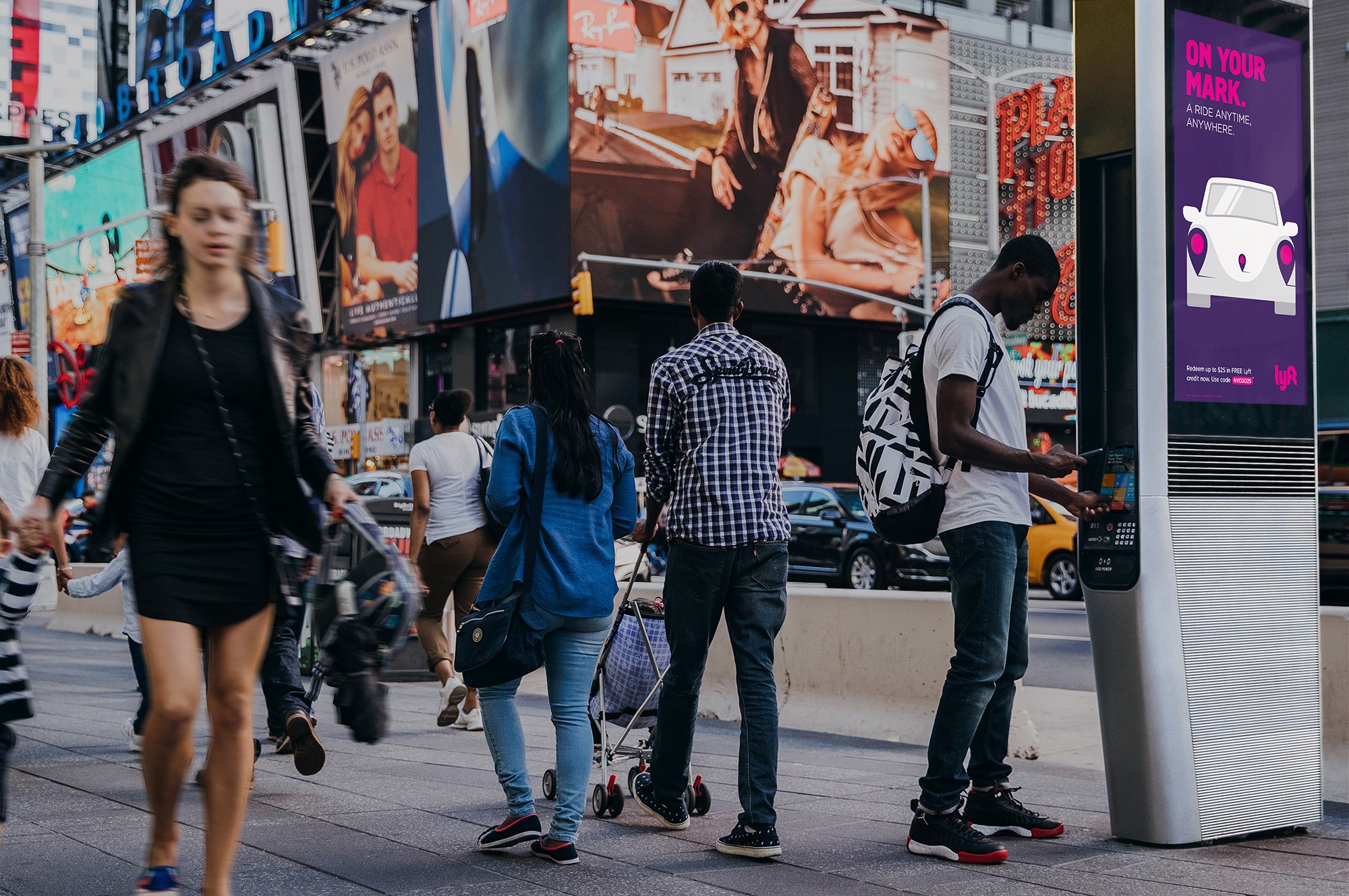
LinkNYC is North America's largest smart city network. A public-private partnership behind the effort to replace every NYC payphone with a street-level hub offering free gigabit Wi-Fi, free calls, device charging, and civic services. Built by Google-owned Intersection in partnership with the City. Two years after launch, the tablet built into every Link had a problem. The experience was flat. The promise of connecting every New Yorker wasn't being kept. And an accessibility issue had surfaced that put the program's legal compliance at stake.
The first tablet shipped with an open browser and deferred the accessibility work. Two years later, that decision caught up with us. Remediation commitments tied to a hard deadline were on the table. The city was still waiting for Maps, 311, and civic services to actually reach all New Yorkers, not just the digitally fluent. And the browsers had been pulled in September 2016 after months of complaints about session length and loitering. Three pressures had collapsed onto the same product. The redesign had to answer all of them with one framework.
A tile grid trying to carry three problems that had nothing in common
The Challenge
When our team set out to redesign the tablet OS, the product team got hit with an accessibility issue serious enough to put the program's legal compliance at stake. Remediation commitments were on the table. Deadlines were attached. We enlisted the Mayor's Office for People with Disabilities and reworked the brief around the users the original product had failed. The city was still waiting for Maps, 311, and civic services to actually reach all New Yorkers. And the browsers had already been pulled over session-length and loitering concerns, so whatever we shipped had to be transactional by default.
Three unique problems
Each one had legitimate demands that pulled the design in a different direction. A tile grid could patch one of them. It couldn't carry all three. The harder realization was that no public-touchscreen accessibility playbook existed. MTA ticketing machines, ATMs, and other kiosks had solved fragments of the problem. Nobody had solved it as a system.
Multiple converging pressures
Accessibility and compliance: Screen reader, TalkBack, zoom, invert colors, and a shortcut key, all required to close the gap and meet the remediation commitments.
Civic services for every New Yorker: Maps, 311, transit, and social services had to reach users well beyond the digitally fluent, at the kiosk, without onboarding.
Engaging but transactional: Session-length and loitering concerns made fast in-and-out use a design requirement, not a preference.
No kiosk accessibility playbook: No standard existed for accessible public touchscreens. We built the bar while clearing it.

SOLUTION
Our solution stopped being about an interface and started being about a framework
A content operating system on top of embedded Android
Tiles that combined and recombined to surface new content without a layout rebuild. Accessibility wired in at the system level, not layered on top. Civic services given the priority placement they'd never actually had. Every flow optimized for completion, not dwell. The framework took on every requirement at the architectural level so no single screen had to carry them all.
Five interaction design goals carried the weight. If a design answered one and failed another, it went back. The framework resolved the three pressures by absorbing them into its logic, not by adding features on top.
Interaction design goals
Surface what matters: Relevant, meaningful information placed where users see it first, legible at a glance.
Engage people in public space: Proactively invite interaction from passersby, not just from users who already know the tablet.
Transactional and impactful: Every task optimized for quick completion. Fast in, fast out, nothing in the way.
Reliable content, real connection: Civic services, transit, weather, and neighborhood information kept current across the network.
Free Wi-Fi, friction-free: Onboarding to the LinkNYC Wi-Fi network simplified to the fewest possible taps.

RESEARCH
Humble beginnings. Rooted in the community
Two research tracks, running in parallel
We ran two research tracks in parallel. Inside, working sessions with the Mayor's Office for People with Disabilities and the group representing low-vision and visually impaired users. Outside, we took full advantage of being able to walk right out of our office doors and into the streets of New York. Eye-tracking studies. Street intercepts. User interviews with real New Yorkers at real Link kiosks. We watched how users approached the tablet, what they tapped, where they got stuck, and what they did when the screen stopped making sense. Both tracks fed the same design decisions.
How we met the users
Internal stakeholder sessions: Mayor's Office for People with Disabilities, CityBridge accessibility team, and civic services leads at the table from day one.
Street-level research: Real New Yorkers tested at real Link kiosks across Manhattan, in the conditions the design would ship into.
Eye tracking and intercepts: Users observed approaching the tablet cold, with no onboarding, the way every user actually meets it.
Contextual kiosk research: MTA ticketing machines and ATMs studied in accessibility mode to understand nearby public touchscreen patterns.
ANALYSIS
Beyond low-hanging fruit. The keypad was the clue
The pivotal research moment
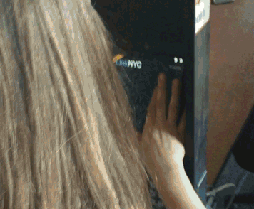
In a session with low-vision users, I watched people trace the tablet's surface with their fingers in a loose F pattern, hunting for the screen reader. Then a community member gave us the breakthrough. Use the tactile keypad they already knew. Press 1, then #. Same pattern ATM users had followed for years. We prototyped it, tested it, shipped it. The keypad was already the answer.
That finding reshaped the rest of the design. We stopped inventing new conventions and started leveraging the ones New Yorkers already knew. The redesign succeeded because we designed for the behavior we observed, not the behavior we assumed.
What the research showed
F-pattern finger-scanning: Observed in-session, users traced the tablet hunting for screen reader activation.
Weatherized tablet resistance: The rugged outdoor surface made TalkBack's double-tap select harder than on a phone.
Community-led breakthrough: Tactile keypad shortcut, 1 + #, to engage TalkBack, inspired by ATM patterns users already knew.
911 button, raised rim: Blind users were triggering it accidentally in testing. We added a tactile rim to prevent false presses.
A bunch of tiles wasn't going to cut it. We needed a content operating system
From layout problem to framework problem
The research made one thing clear. The tablet had to stop behaving like a static grid and start behaving like a system. We tested six design approaches across the street, the studio, and with partners at the Mayor's Office. Each one traded something off. Density versus legibility. Passive browsing versus transactional flow. Fixed layouts versus configurable content. By the end, two finalists emerged that cleared every interaction design goal. We took both forward to user testing.
Framework directions explored
Zoned grid: Promoted content zone plus core app zone, with distinct visual weight for each.
Offset grid: Tiles combined vertically and horizontally for pronounced visual hierarchy.
Content-first layout: Tiles sized to content type, improving passive browsing for users without a specific task.
Scalable tile system: Modular grid that accommodates future content without a redesign pass.
How might we
How might we make a public tablet legible at a glance, accessible by default, and usable without a tutorial?
How might we get Maps, 311, and civic services in front of every New Yorker, not just the ones who already know the pattern?
How might we make the experience engaging enough to use, and transactional enough to leave?


ITERATIONS
Head to head, for the crown. Six concepts, two finalists, one framework
Feedback from three rooms, iterated into one coordinated sprint
The final iteration pulled feedback from the Mayor's Office accessibility partnership, civic services stakeholders, and on-street user sessions into one coordinated sprint. Every decision traced back to one of the three pressures. Nothing shipped that couldn't defend itself against at least one of them.
What the research sessions surfaced
Low-vision user testing: Mayor's Office sessions where the F-pattern finger-scanning got observed and the 1+# keypad shortcut got validated against real user criteria.
Street research at live kiosks: Eye-tracking studies, street intercepts, and user interviews conducted in the same environment the design would ship into.
Engineering review: Load-in animations, scrolling, and ripple effects validated against embedded Android, scoped to what kiosk hardware could reliably execute.
Civic service tile design: NYC 311 became the template for every government and civic service tile across the framework.
What changed in the framework
Offset grid UI: Tiles combined vertically and horizontally to create pronounced visual hierarchy. Calls to action made explicit at tile level.
Accessibility primitives: Screen reader, TalkBack, zoom, invert colors, and a shortcut key wired into the framework as first-class features, not optional layers.
Status and nav bars: Status bar carries time, date, brightness, and Info and Privacy links. Nav bar enables app switching, launcher return, and back.
Civic services zone: 311, Maps, emergency services, and transit placed at the highest tier of the tile hierarchy. Legible without prior knowledge of the interface.


01
Accessibility as the floor of the framework, not the ceiling
02
Civic services placed by rule, not by designer discretion
03
Transactional flow by default, not patched with restrictions
FINAL DESIGNS
Down to the edges. What you tap, where you look, what you walk away with
The shipped framework
The final design wasn't a layout. It was a system. A grid that carried every requirement at the architectural level, not the screen level. Civic services got placement priority by rule. Accessibility primitives shipped in the framework itself. Every flow was transactional by default. Partner content and promotions slotted into a structure built to absorb them without breaking the logic. New content became a configuration exercise.
What shipped
Civic services tier: Google Maps, NYC 311, transit, and city service portals at the top tier of the tile hierarchy, legible without onboarding.
Accessibility at the system level: Screen reader, TalkBack, zoom, invert colors, tactile 1+# shortcut, all first-class framework features.
Free domestic calling and 911: Free calls anywhere in the U.S. Dedicated red 911 button with the tactile rim added after blind-user testing.
Free Wi-Fi onboarding: Lightweight app connecting personal devices to the LinkNYC network in the fewest possible taps.
Scalable tile system: New services, partners, and campaigns deployed into the framework without layout rebuilds.
Accessible beyond accessibility. A framework future content could deploy into, no designer required
Partner and secondary surfaces
The framework had to carry more than the core services. Wi-Fi onboarding for personal devices. Social service finders for the unhoused. Free local promotions for small businesses. A Digital Out-of-Home ad platform for partners. All running inside the same framework without competing for the attention users actually came for.
What the framework carried
Aunt Bertha Services: City NGO and social services finder, surfaced at the civic tier for every New Yorker who needed it.
LinkLocal Promotions: Free promotional slots for local small businesses and community organizations across nearby kiosks.
DOOH Ad Platform: Partner campaigns with measurable attribution, running alongside civic content without disrupting it.
Privacy by design: Headphone port for private audio on calls and for TalkBack screen reader output. Transactional exits made explicit.


IMPACT DELIVERED
That's how we left our mark on New York City
And on the New Yorkers it was built to serve
The redesigned tablet shipped to the LinkNYC network across all five boroughs. The accessibility commitments got delivered on schedule, closing the compliance gap that kicked off the project. Civic services rose in prominence. Wi-Fi onboarding got faster. Session-length complaints collapsed as transactional flows replaced the browsing-oriented layout.
The loitering and privacy headlines that dominated 2016 moved off the front page. What started as a compliance remediation ended as a content operating system New Yorkers could actually use. The framework absorbed every new partner, every new civic service, and every new campaign without a redesign. We got there by doing honest UX work with the people the tablet was built to serve.
What the redesign delivered
Accessibility debt paid: Screen reader, TalkBack, zoom, invert colors, and 1+# keypad shortcut all shipped on schedule.
Loitering complaints collapsed: Neighborhood complaints about session length and kiosk monopolization dropped 96%.
Civic services reached further: 12% increase in unique users accessing Maps, phone calls, and NYC 311 after the redesign.
Wi-Fi adoption jumped: Users who couldn't navigate to the service before were getting there in the fewest taps possible.